
Vente
Helping find the best events near you.
The Brief
To create an engaging visual design for a mobile responsive platform that reimagines how people can find events near them that match their interests.
Tools
Sketch
Adobe Illustrator
Invision
Zoom Video
Deliverables
Branding and Logo Design
High-Fidelity Mock-ups for the Mobile App
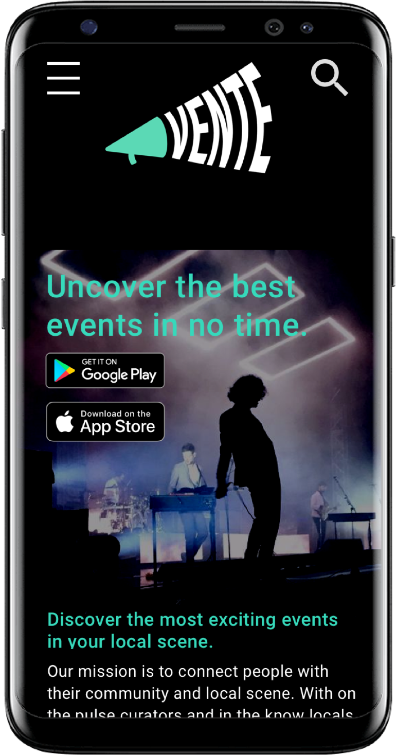
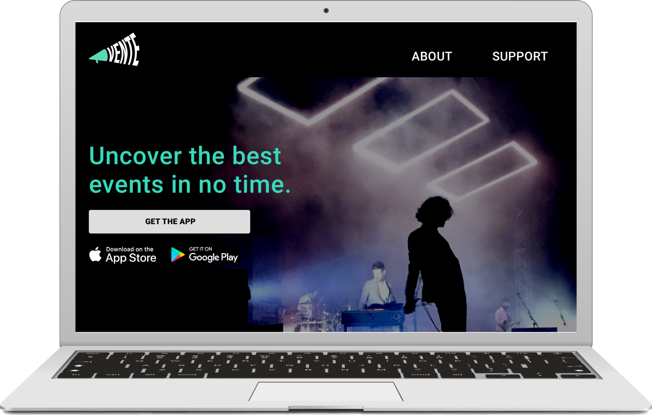
Responsive Web Design for Marketing Site
Prototype
Style Guide and UI Kit
Skills
UX/UI Design
Branding
Logo Design
Research
Time Scale
4 agile sprints
1 month deadline

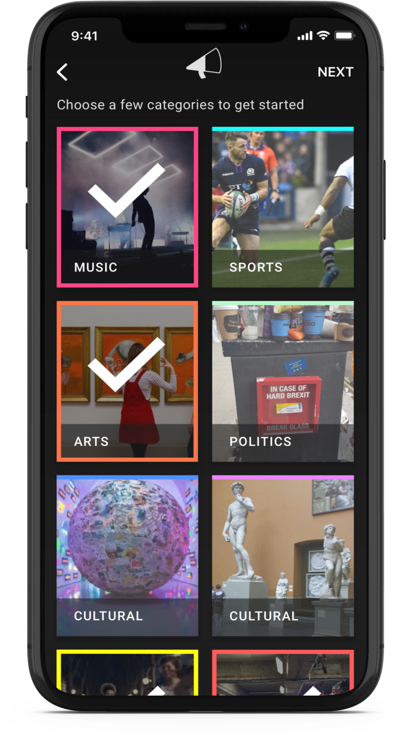
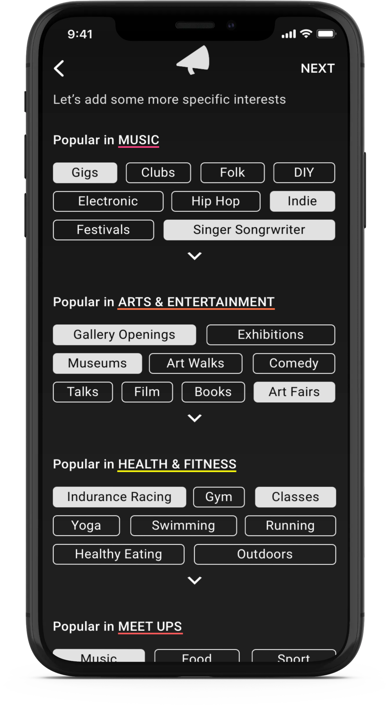


Defining the Problem
Despite the endless sea of local events, consumers continue to struggle to sift through it all to uncover activities that align with their interests.
Evaluating the wireframes
When evaluating the wireframes the UX team had provided, given that the problem is to find events quickly I felt that we could improve the usability of the app by:
finding what friends are attending through social connectivity
provide a quicker and more digestible user flow
User Personas
The user personas provided by the stakeholder further highlighted that we needed to find a solution that helps users:
sift through the noise to find what interests them
find events quickly and efficiently
Competitor Analysis
I conducted some research into the event market to find issues and gaps that would determine our unique selling points going forward. I found that Meetup, Eventbrite and Dice were all excellent examples of different approaches.
Meetup: Use of grid system provides a clear and digestible structure
Eventbrite: Use of whitespace here makes content pop
Dice App: Multiple bright colours create excitement
Brand Exploration
Style Direction
I decided to go down a dark UI route because:
Most events we attend are in the evening after you stop working
I was inspired by exciting, cutting edge, independent culture, and the night life that surrounds you in the city
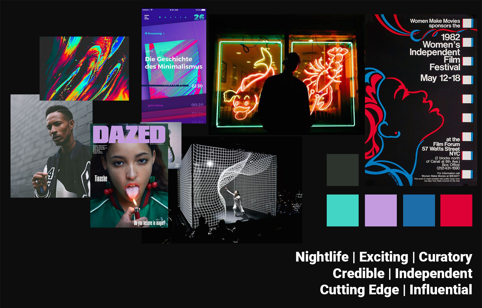
Style 1 - Exciting Nightlife (Chosen style)
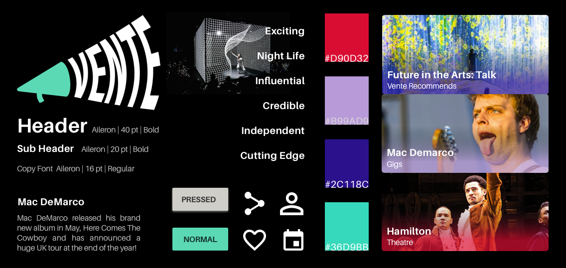

Style 2 - Bustling Colourful City


Style 3 - Warm and Welcoming

Logo Design
To kick off brand and logo inspiration, I began with some adjectives:
Independence
Credible
Curatory
Creative
Loud
I started by sketching
Final Logo: The Megaphone
Then made digital versions
This concept is all about the importance to stand up for independent events in your community, which are vital in making local scenes and economies thrive. The megaphone and bold text represents a call to action, symbolising support for every individual person who makes up the community.
Consumers need help being kept informed. The increasingly loud text coming out of the megaphone illustrates that Vente makes sure users are kept up to speed with the best events going on in their area - so they don’t miss a beat, even with lots of events going on at once.
User Testing
High Fidelity Designs
My first iterations had a green mint colour theme. I also added an orange highlight colour as an experiment to differentiate and create a tile effect with a grid system.
Testing Goals
To test prototype
Understand how users look for events
See what tools they use
Key Insights
The users found it frustrating that there’s not an app that unifies all events locally
Social engagement with friends in the app needs to be clearer
Combine search and home together through search filter
Users were confused with the colour scheme
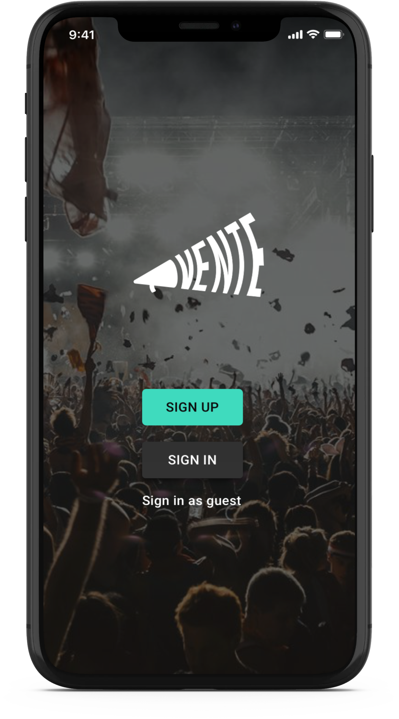
The onboarding process should be more engaging to the user
Responsive Marketing Site
Design Solution
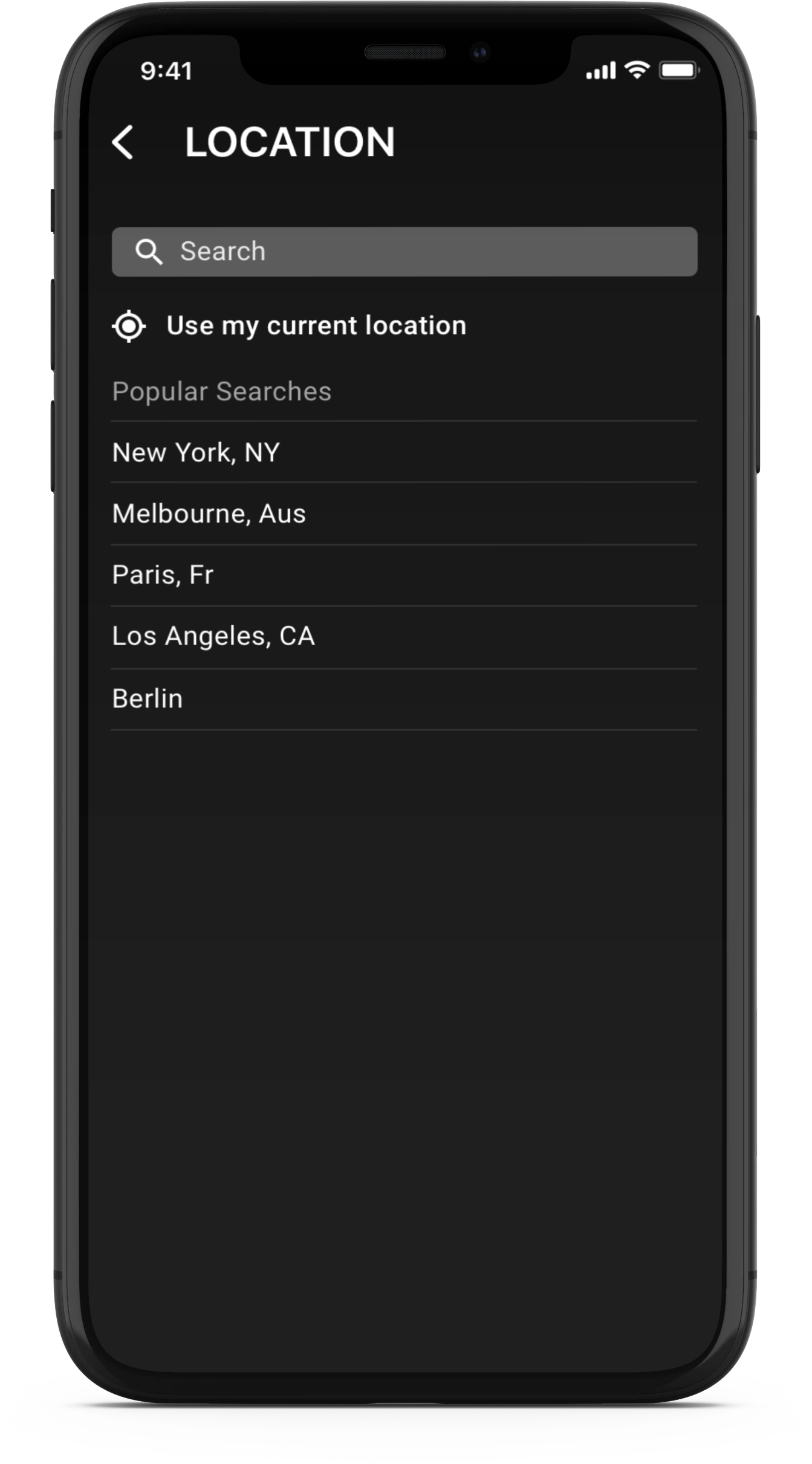
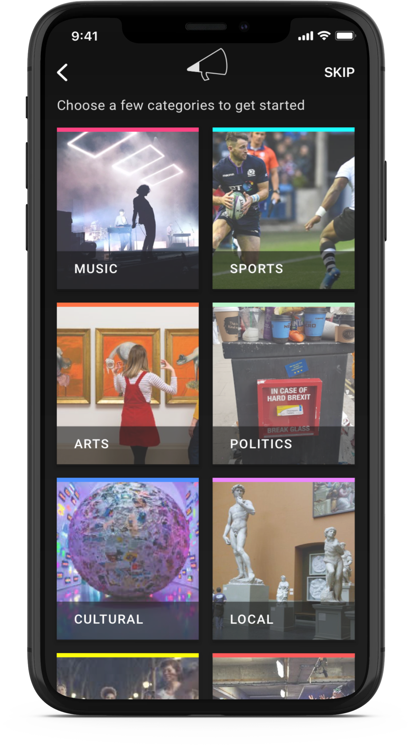
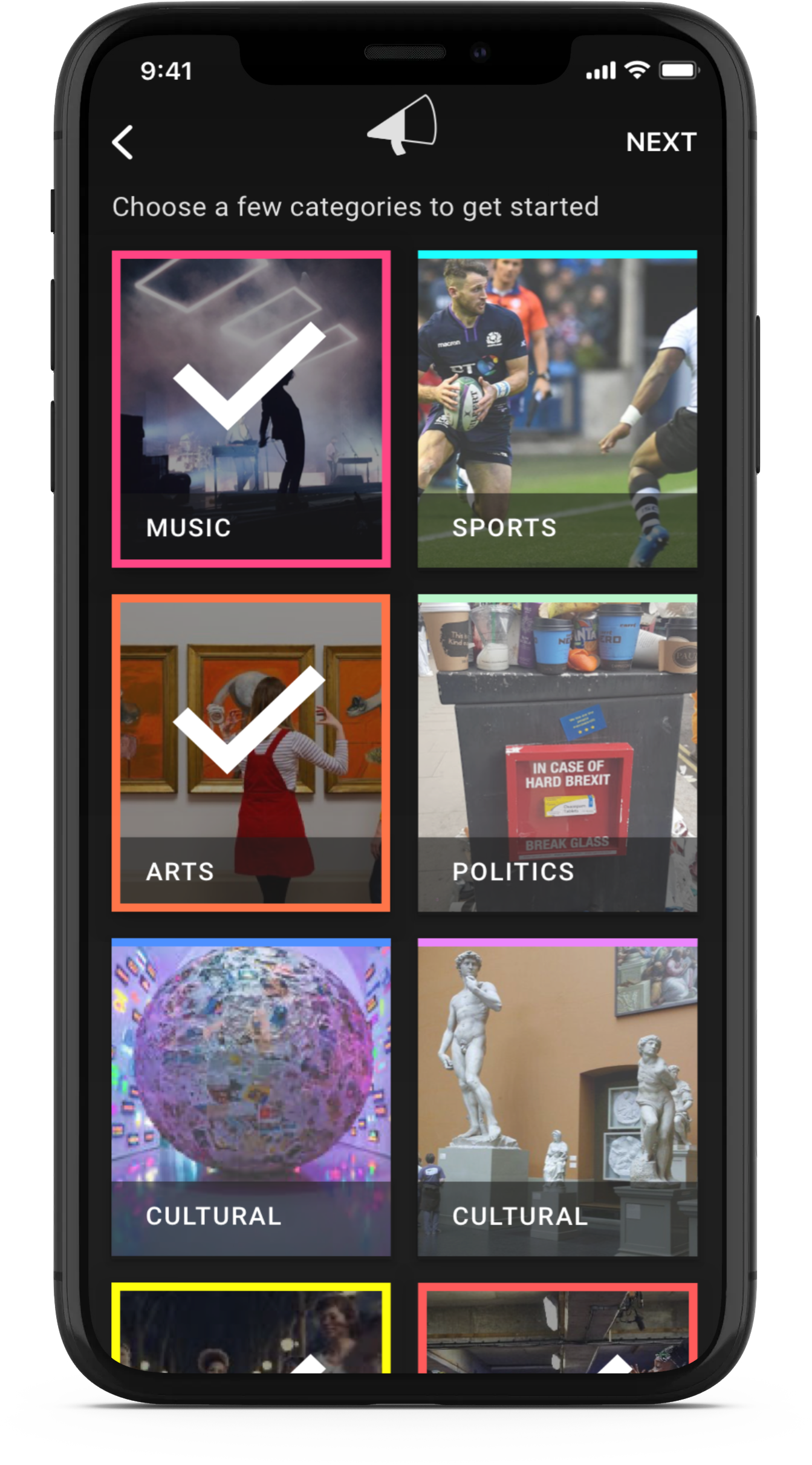


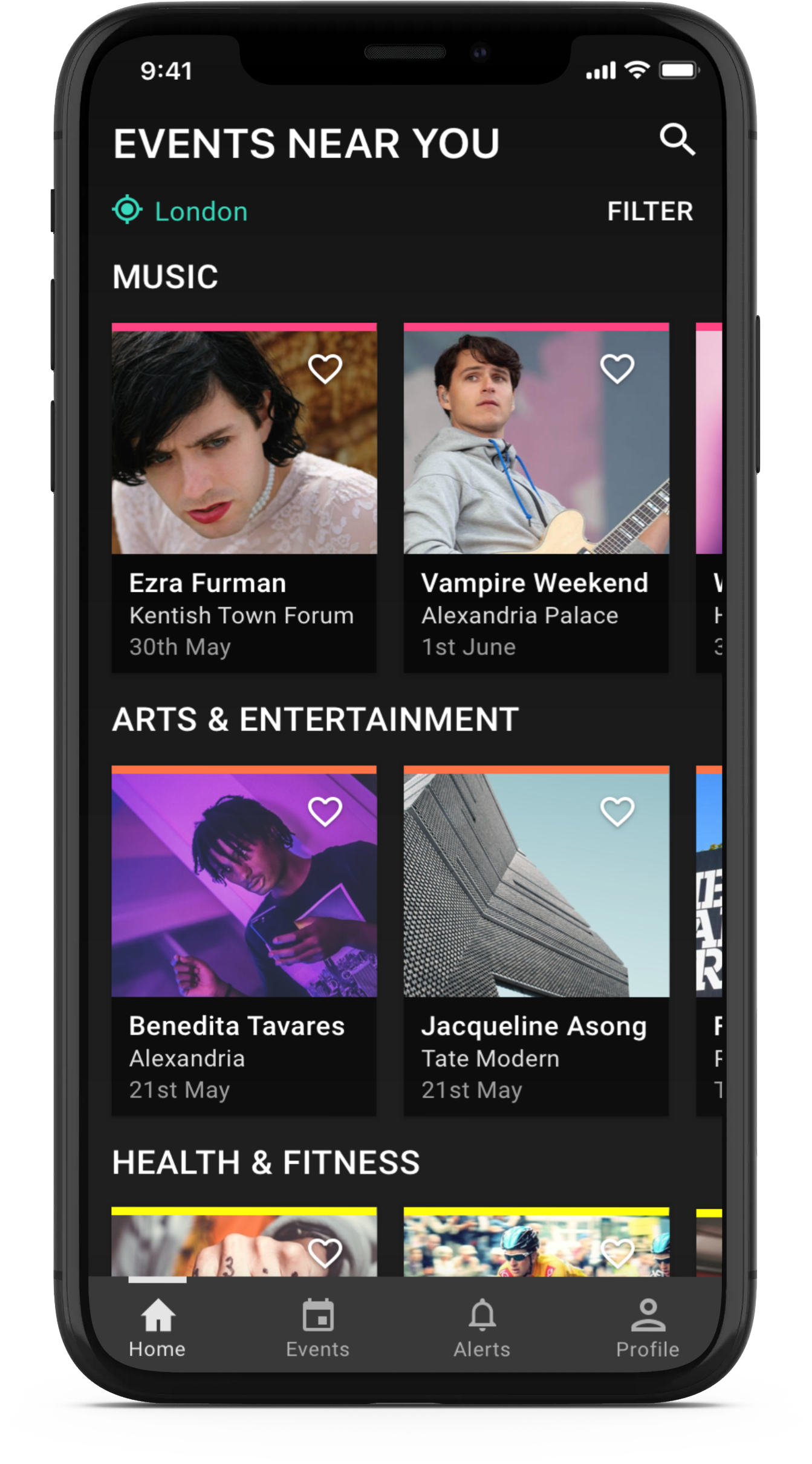

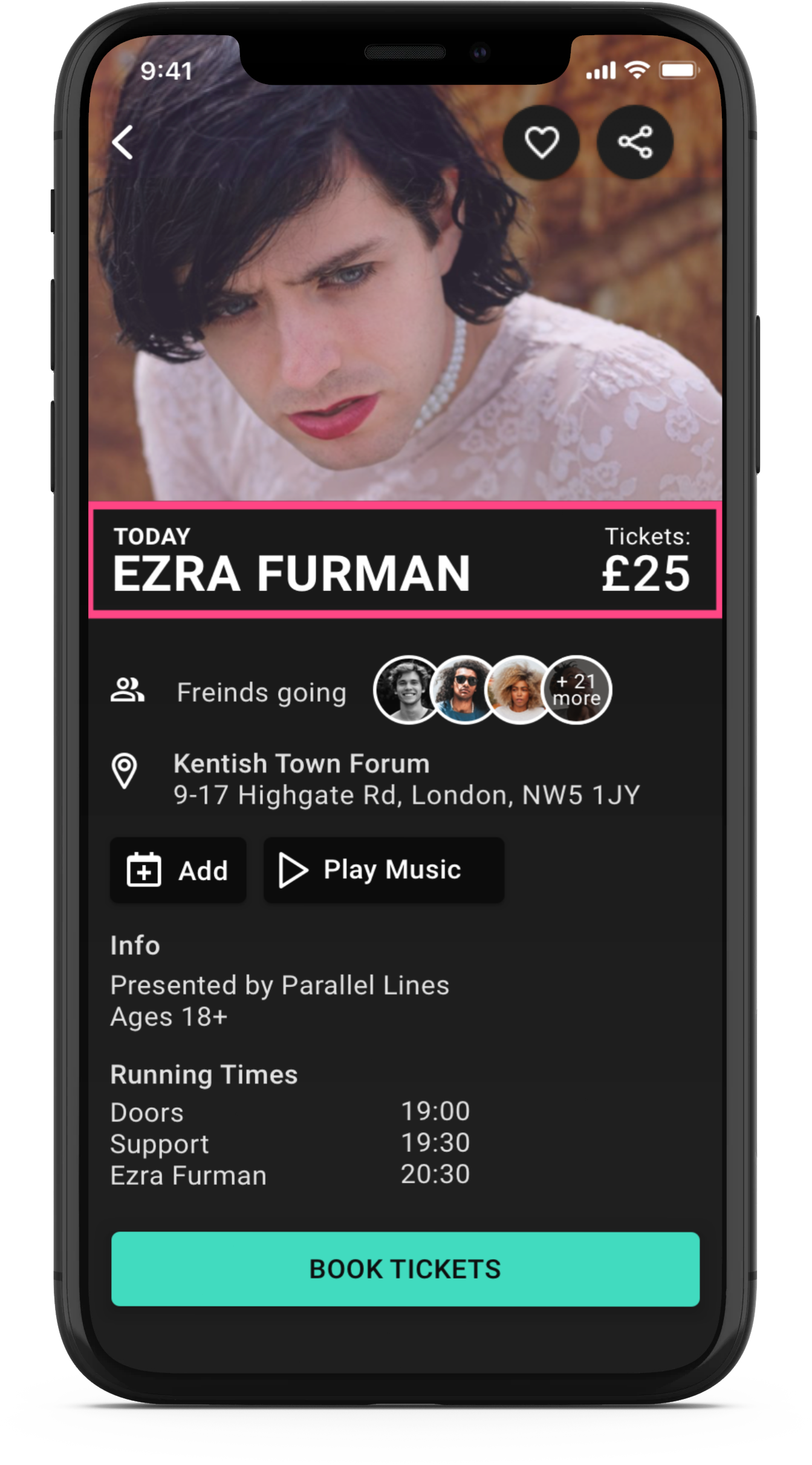
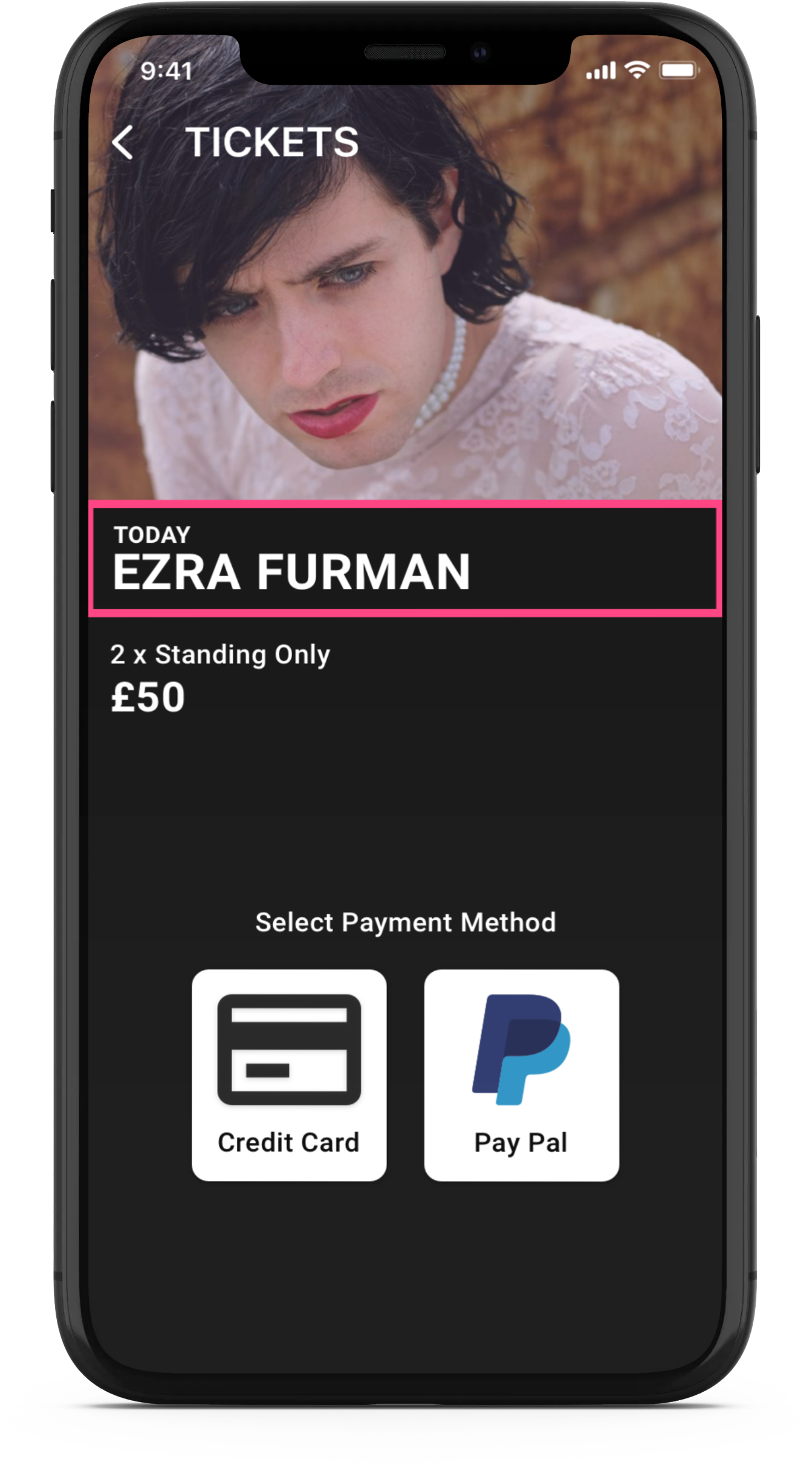
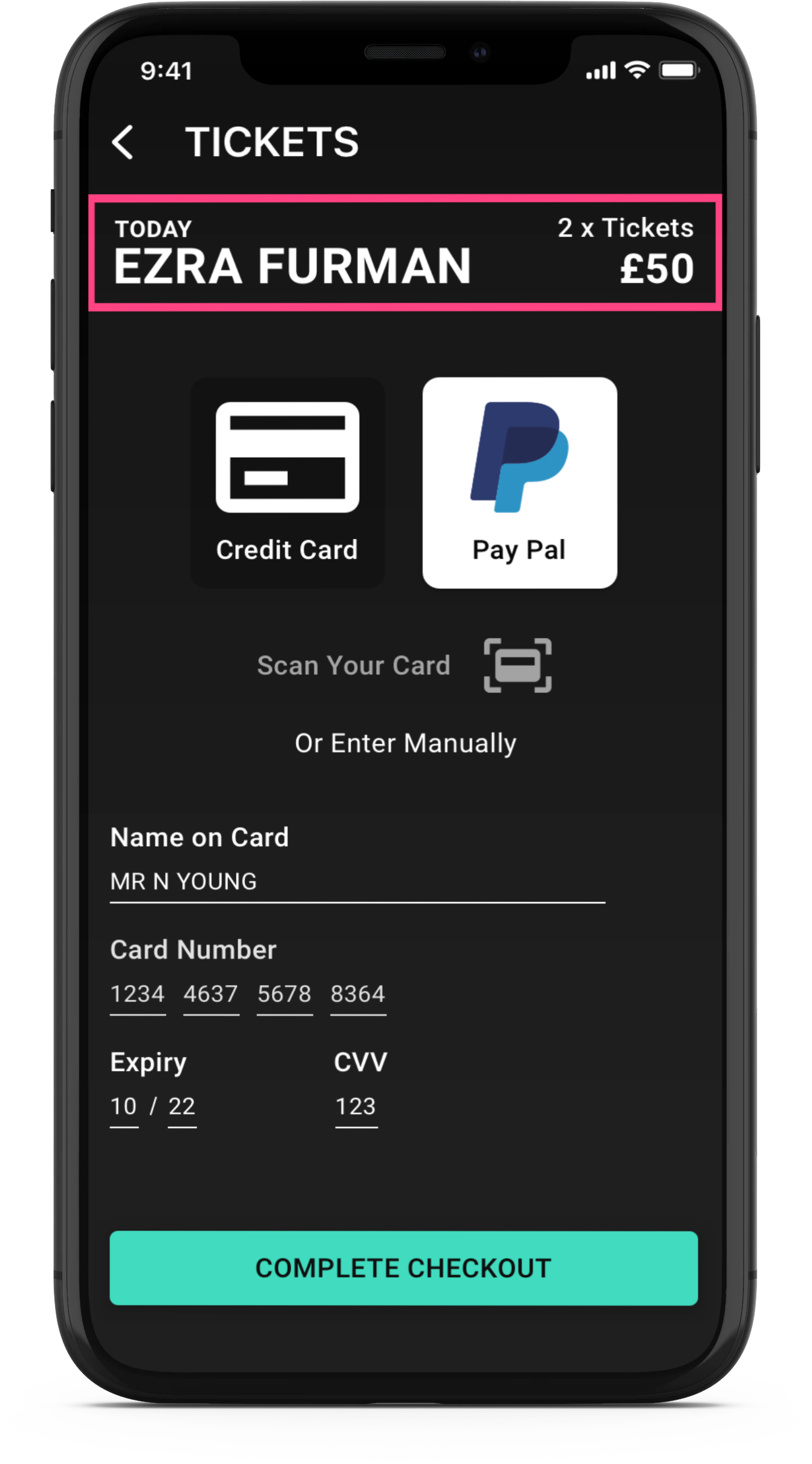
New Design improvements
Megaphone progress bar added to onboarding
Subtle strip of multiple colour used to categorise along with mint highlight theme
Clearer, close up photography
Nav bar selection clearer
Friends attending function is clearer
Search appears combined on top of home page
Reflections
This project helped me really hewn my design skills and understand how the design process fits together from start to finish. Live events are a big passion of mine having worked in music for 12 years and it was really fun to build a product that consumers would love to use; not only find events that they like, but to discover new events that they love.


