Metric
An administrative data dashboard tool for store managers.
The Brief
Design a refreshed look and feel that improves store managers ability to take valuable insights from employee data and customer feedback
Tools
Sketch
Adobe XD
Mural
Zoom Video
Deliverables
Logo Design
Responsive high fidelity screens
Design system
Skills
UX/UI Design
IxD Design
Branding
Logo Design
Research
Time Scale
4 agile sprints
1 month deadline
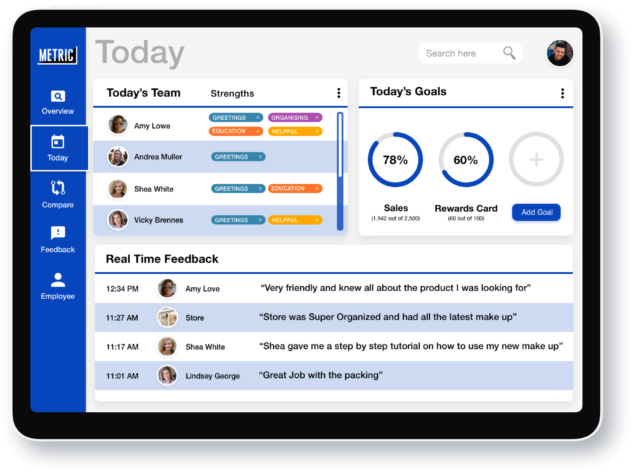
Final Tablet design
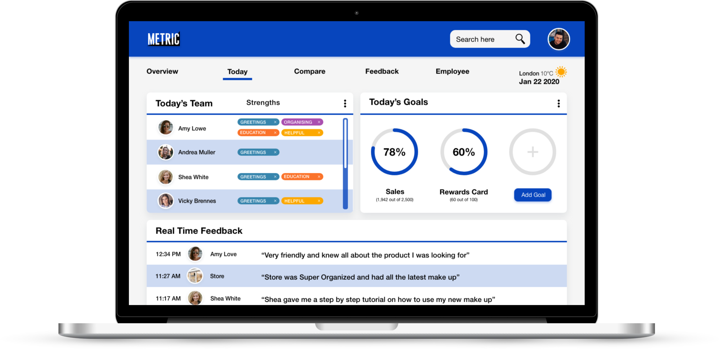
Final Desktop Design
Defining the Problem
The UX team provided us with a foundation of assets that formed the basis of the project, which included wireframes, user personas and problem statement.
Problem statement
Store managers as well as upper management need a dynamic interface that can display customer feedback analytics in order to clearly identify areas of improvement and examine the relationship between customer experience and sales.
User Personas
The provided personas asserted our mission to provide users with precise, quick and digestible data.
Design Principles
We chose three design principles that would help us keep our user in mind throughout the design process.
Researching the Space
Domain Research
Photograph credit: Shutterstock
The retail sector is the largest sector in the UK with over 3 million employees, and it’s growing.
59% of retail leaders say Voice of Customer data is the most important for their growth.
Consumer feedback is becoming increasingly important for businesses
Competitor Analysis
To gain good insight into the tools available, we analysed the most popular performance management and customer experience feedback systems.
To get a good sense of how data is used visually, we also analysed some popular data visualization dashboards as indirect competitors.
Key strengths:
Single brand colour works well with multiple colour data visualisation
Professional, trustworthy as well as the friendly look and feel
Visualisation is given room to breathe
Opportunity to find a competitive edge
Combine the best in the market
There are no tools for combining performance management with customer feedback and nothing focusing on a performance that brings visual data to life like data visualisation software.
Focus on clear visual hierarchy
A lot of platforms are visually overwhelming or underwhelming.
Create smooth responsive transitions.
Some desktop/tablet screens don’t translate well and lose brand identity in mobile form.
Brand Exploration
Style Direction
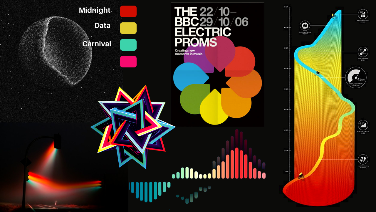
We created divergent moodboards, giving us the chance to explore themes and create design visions which would form visual directions for the project.
Moodboard 1 - Vivid colour showcases excitement. Data is striking and accurate.
Moodboard 2 - A slightly goofy fun feel which you might need after sifting through a lot of rigid, lifeless data.
Moodboard 3 - Smart with bright colours gives a feeling of business in the modern era.
Testing Styles
To establish our design directions we wanted to explore different moods:
Dark background vs Light background
Minimal vs In Your Face
So we asked users to provide positive or negative feedback for each chosen style, to help us.
The users liked the vivid and interesting colours but overall too many people didn’t like the dark UI theme.
I decided to explore a lighter theme, taking inspiration from the overall insights taken in this test:
Make information easily digestible
Keep it simple, but have an edge
Make the look trustworthy
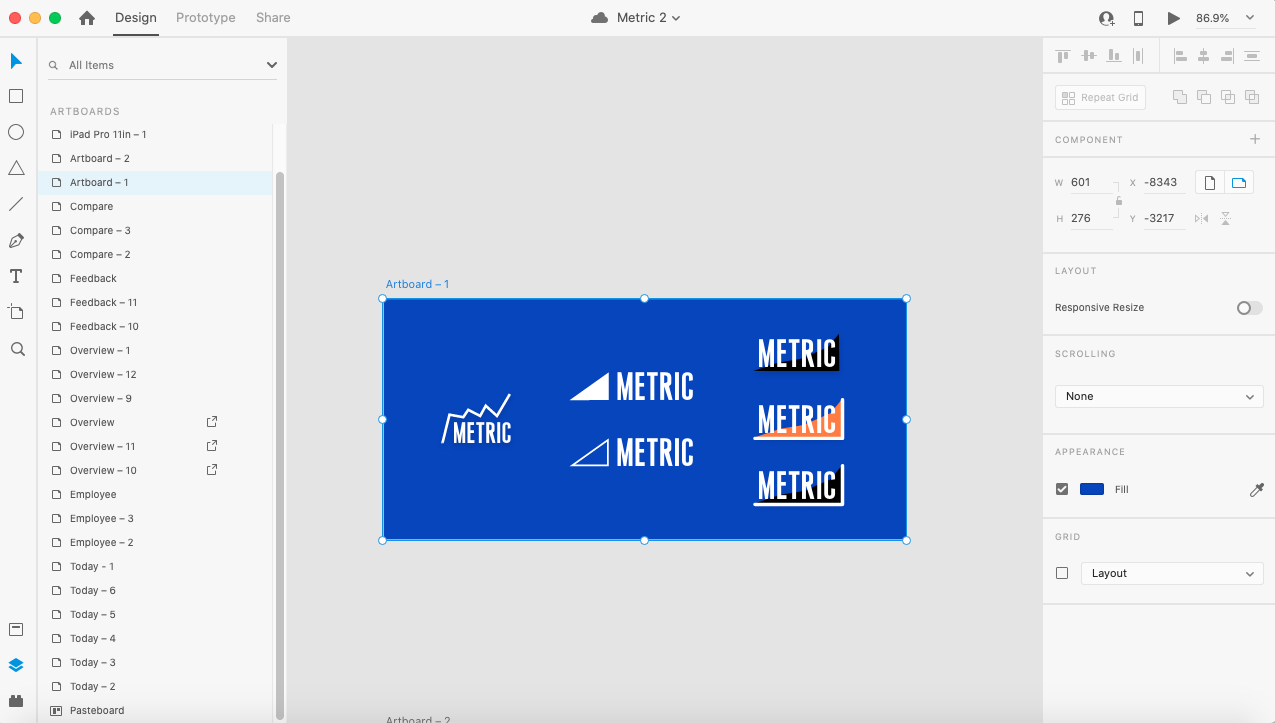
Logo Design
I liked the idea of exact, accurate data so I decided on the brand name Metric.
The bold, straight edged, Metric font represents confident, accurate data, whilst being married up with a rounded edged axis showcasing a softer, modern approach. The black brings a striking contrast especially atop of the trustworthy Metric blue background.
User Testing
Summary
User companies
Burberry
We Work
Rag & Bone
Club Pilates
Snow & Rock
No. of Participants
7
In Person
4
Remote tests
3
Store Manager Interview insights
There is a need for a single system and is also available on mobile.
Data needs to be clear, digestible and actionable
Should have a balance between fun and serious.
Preference of light UI over dark UI.
“It’s ideal to work in just one system”
Selin Ozdiktas, General Manager at WeWork
First Iteration
After evaluating the wireframes and taking into account the user feedback so far, I came up with a design inspired by early analogue 90’s computer graphics to showcase simplicity from an era that is on trend.
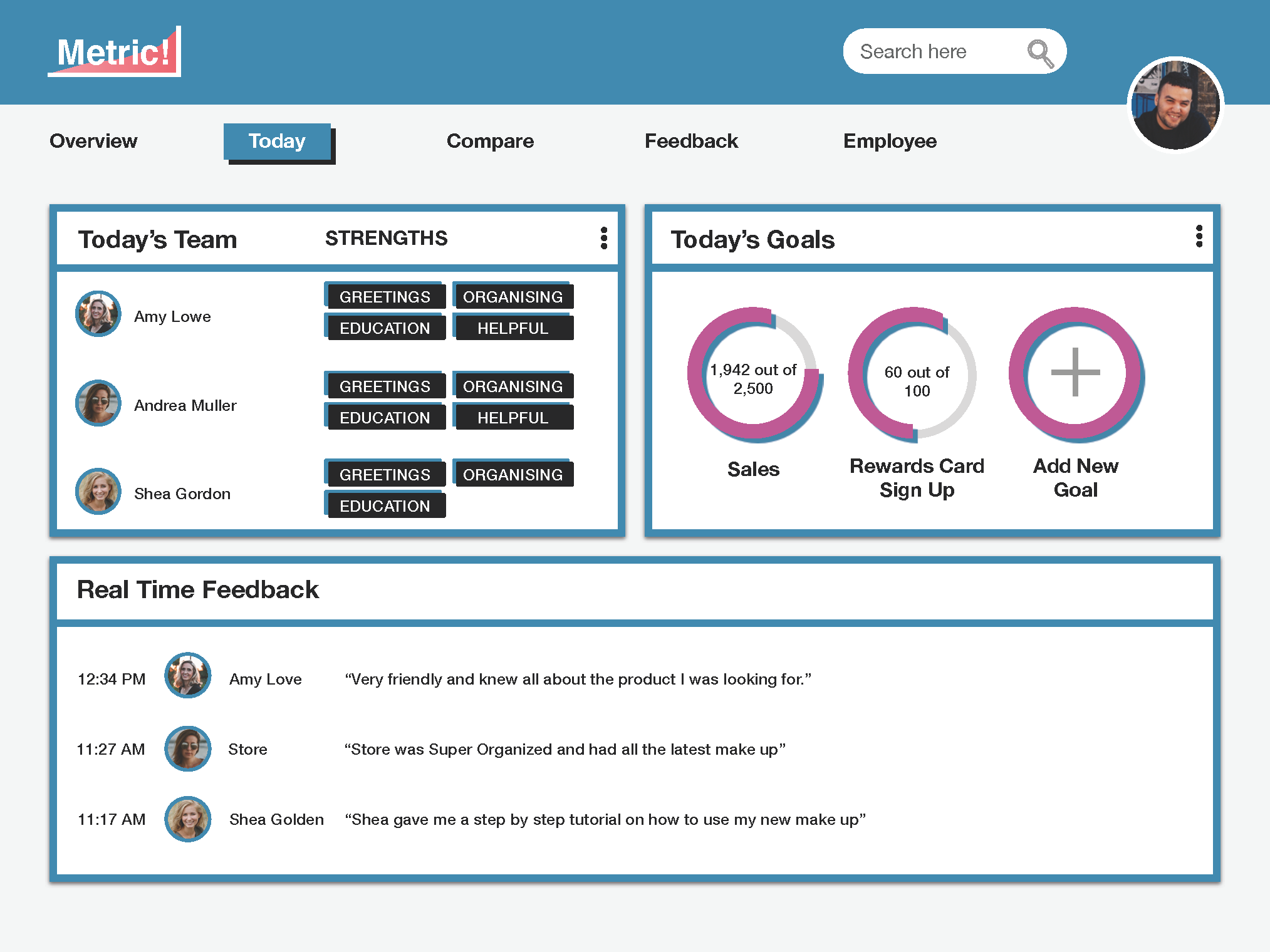
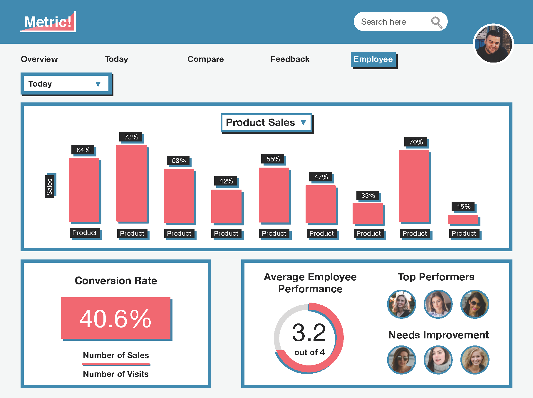

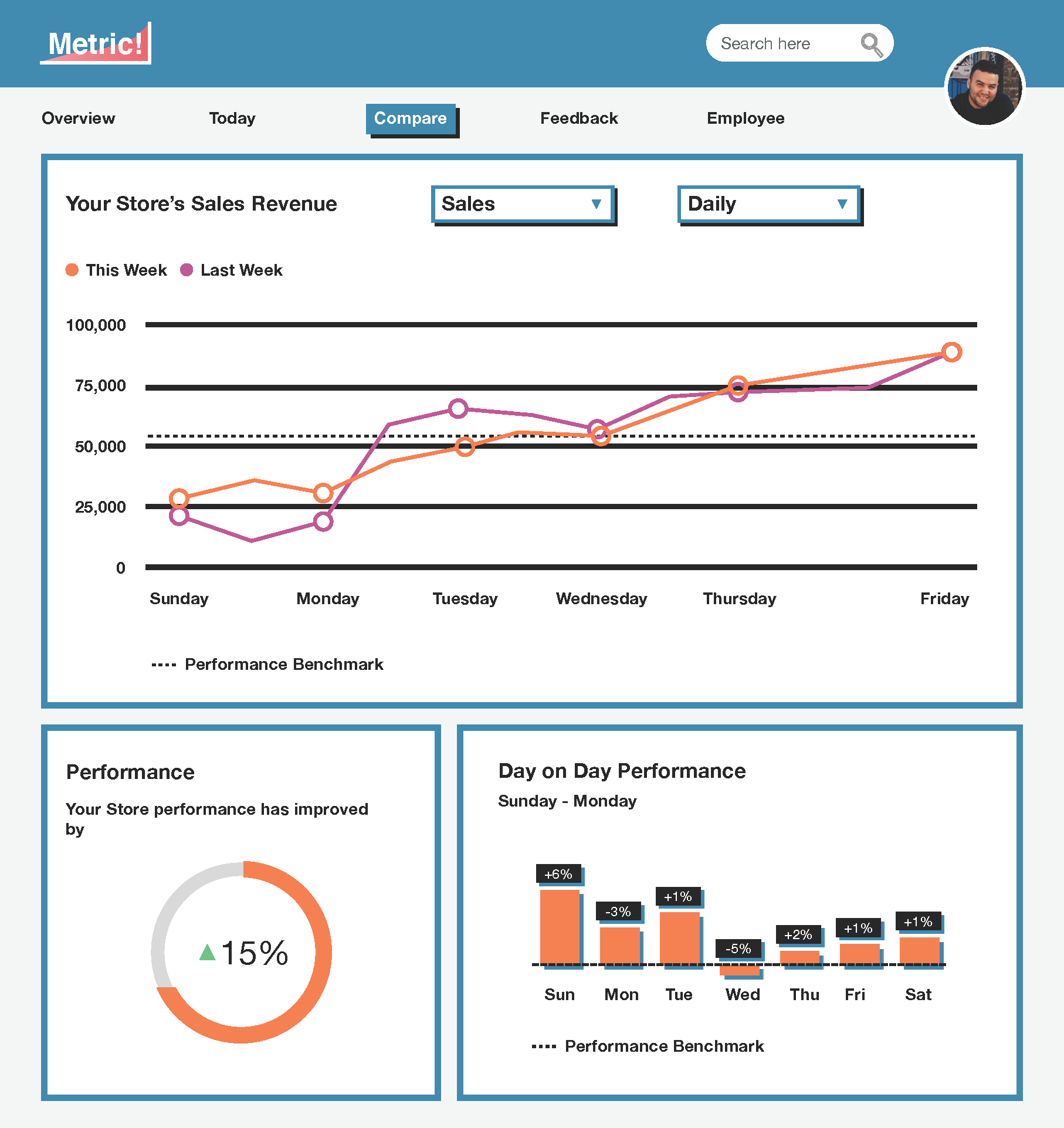
The top findings from having tested this first design were
Users only want the data that’s usable to them; current reports have too much irrelevant information
The relevant data needs to be memorable and engaging
“Our current system makes my eyes tired”
Anna, Snow & Rock
Design Solution
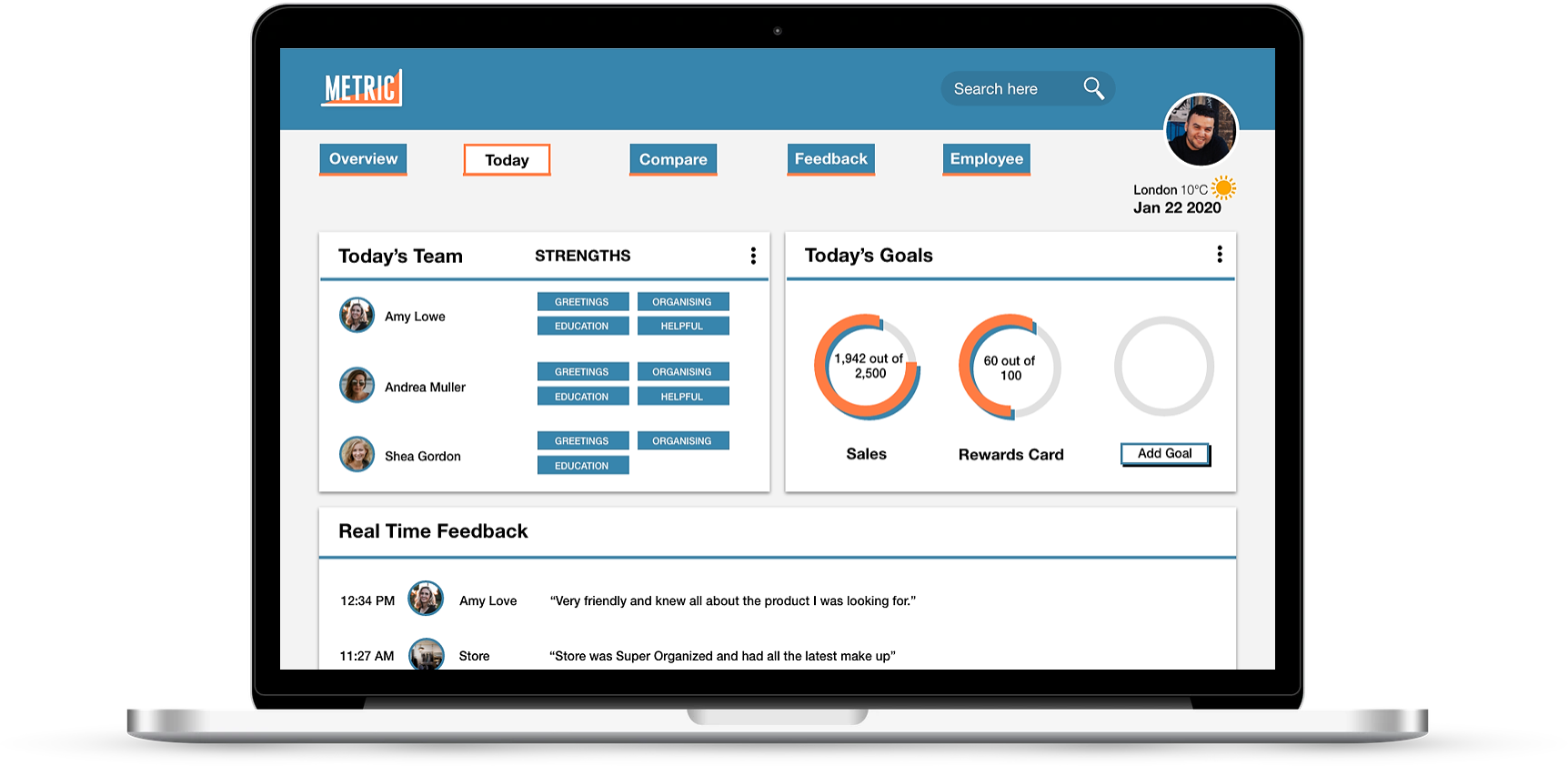

Improvements
Cards have drop shadows and no borders
Styles differentiated from buttons to avoid confusion
Colour simplified, red taken out as main colour to avoid negative connotations
Bitesize and relevant data
Data shows benchmarks and goals
Further changes to consider:
Data visualisation drop shadow - it still looks clickable.
Hard edge old school designs may not appeal to a wider audience.
New Design Iteration
After some thought and research into modern dashboards, I iterated further with a more modern approach. The new design is more rounded and whilst being refined, it’s colourful without looking corporate.
Reflections
This project was an excellent challenge that I am very grateful to have gone through. Working in a design team and exploring multiple design and testing rounds was a fantastic learning curve for me to refine my design skills, setting me up well for the next challenge.


