
Snowball
Empowering people to take action on climate change.
The Brief
To create a bold re-brand and re-design of the snowball Website
Tools
Sketch
Adobe XD
Mural
Typeform
Zoom Video
Deliverables
Style Tiles
Divergent Style Directions
Prototype
Style Guide
Skills
UX/UI Design
IxD Design
Research
Branding
Time Scale
4 Weeks
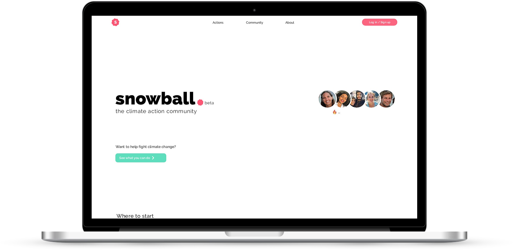
The old homepage
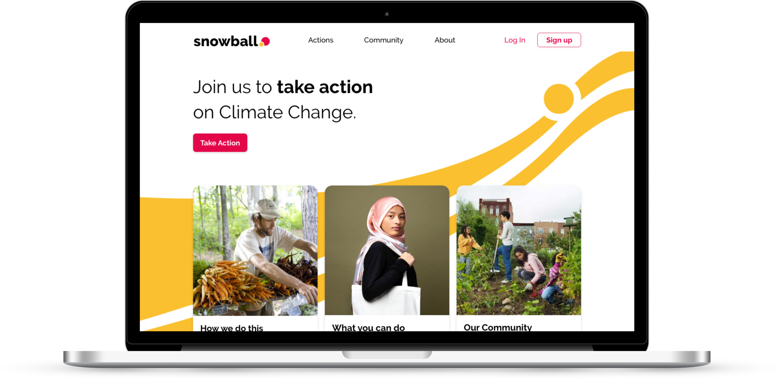
The re-designed homepage
Skip to Sections
Researching the Space
Domain Research
Photograph by Anders Hellberg taken from The New Yorker
There’s an increasing amount of climate change activism among the younger generation, led by Greta Thunberg.
Recent poll suggests 66% of people in the UK would make personal sacrifices for climate if they knew others were doing the same.
There’s growing evidence that economies would benefit from climate change action.
Competitor Analysis
After analysing some direct competitors (see below), we took inspiration from 2 indirect competitors:
Airbnb: Photography had a real life, community feel and was different from the stock images found in competitors.
Drink Seriously: Striking and bold design, with great use of whitespace and bitesize information.
Full competitive analysis can be seen here.
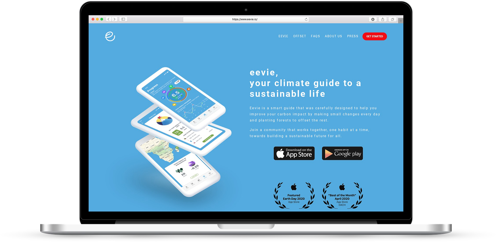
Eevie - Corporate looking background
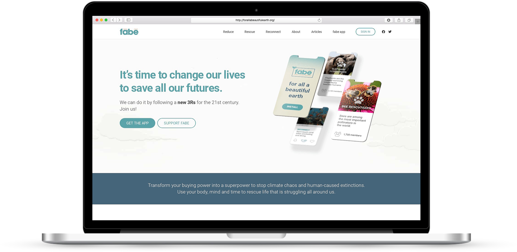
For all a Beautiful Earth - Clear CTA's
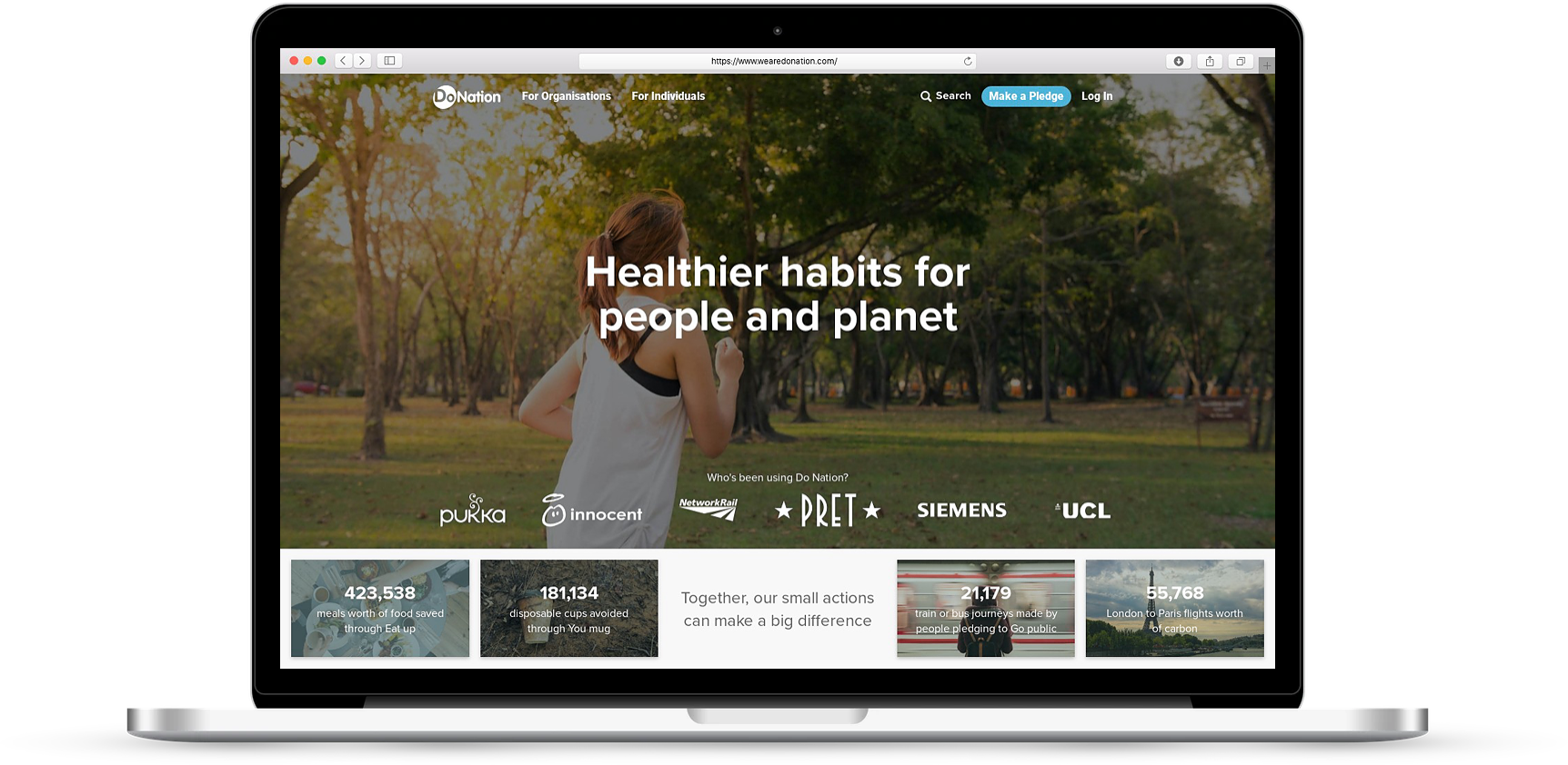
DoNation - Community feel but lacks consistency
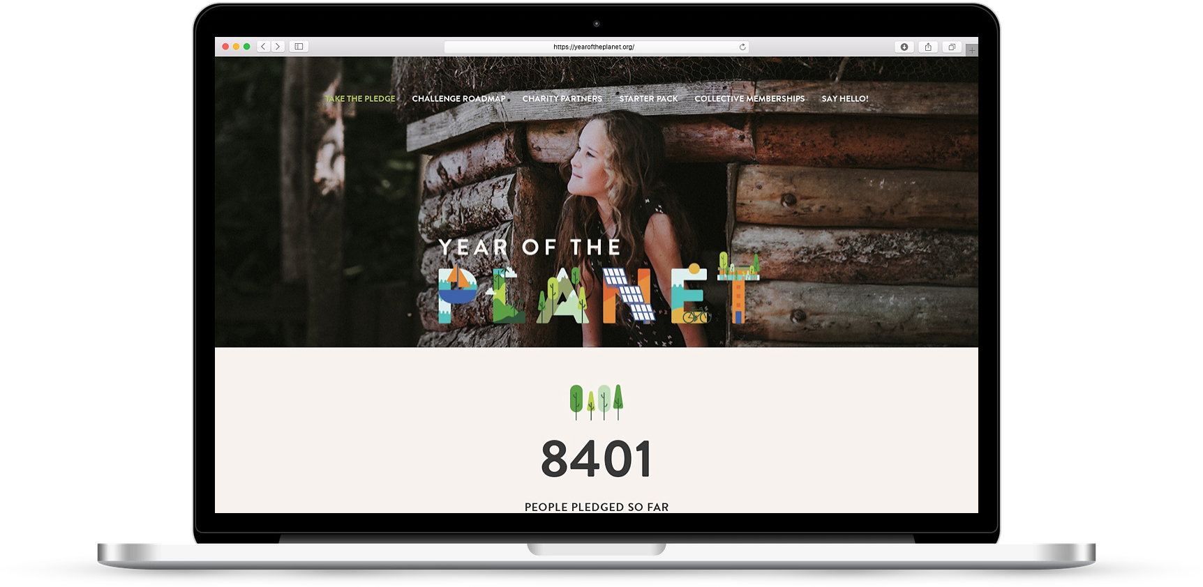
Year of the Planet - Quite childish
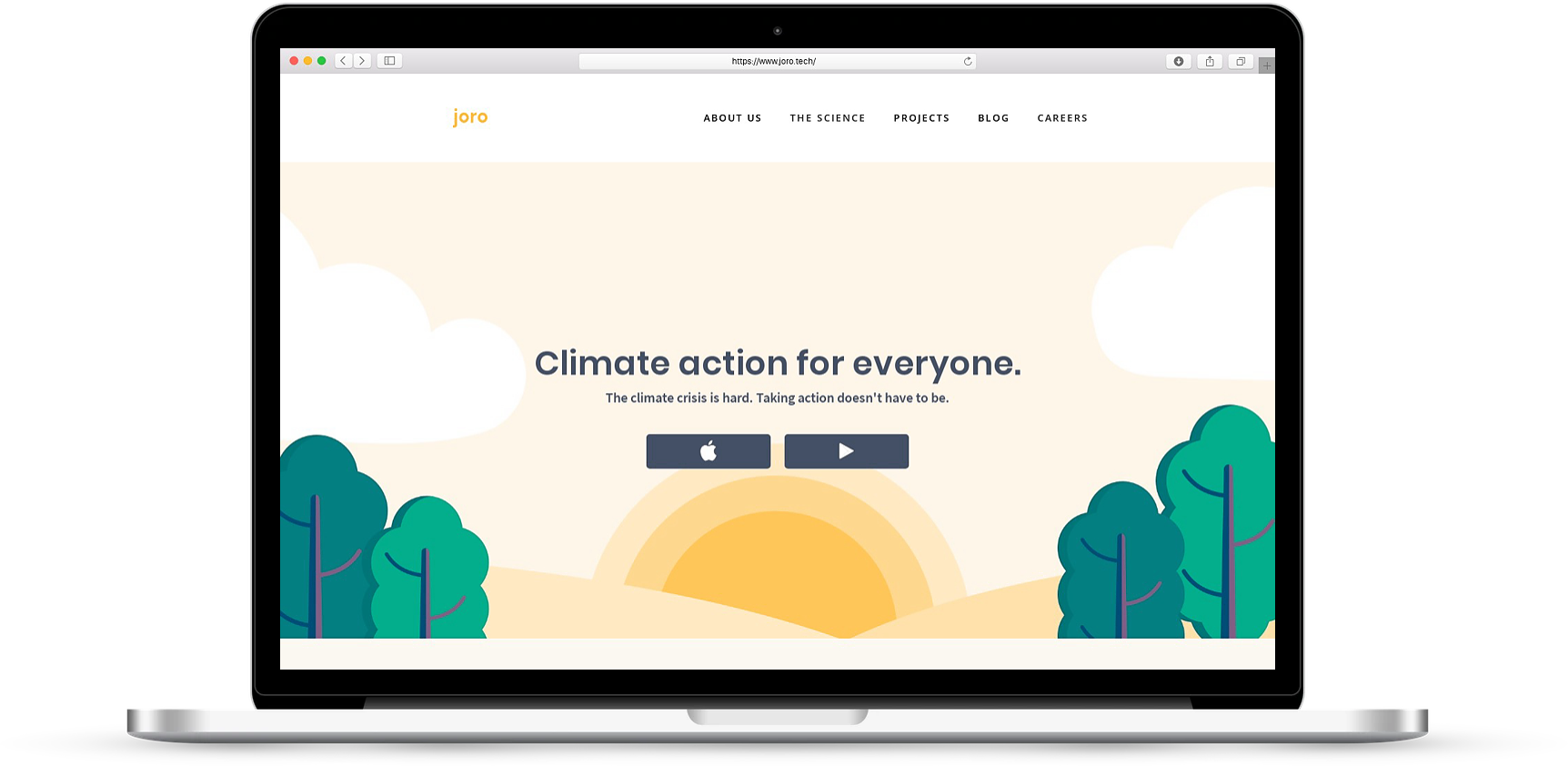
Joro - Overuse of stock photography
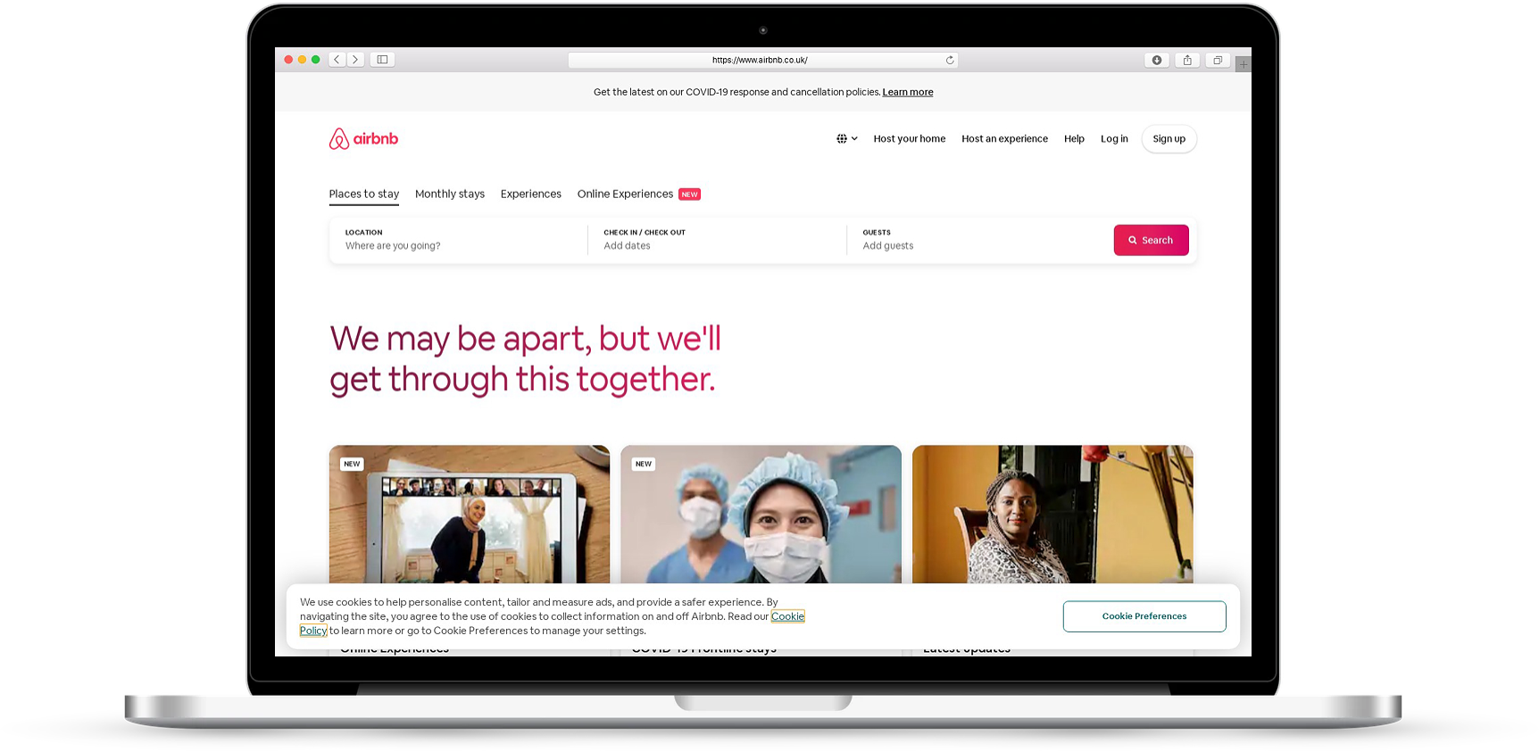
AirBnB - Great use of "Local" photography
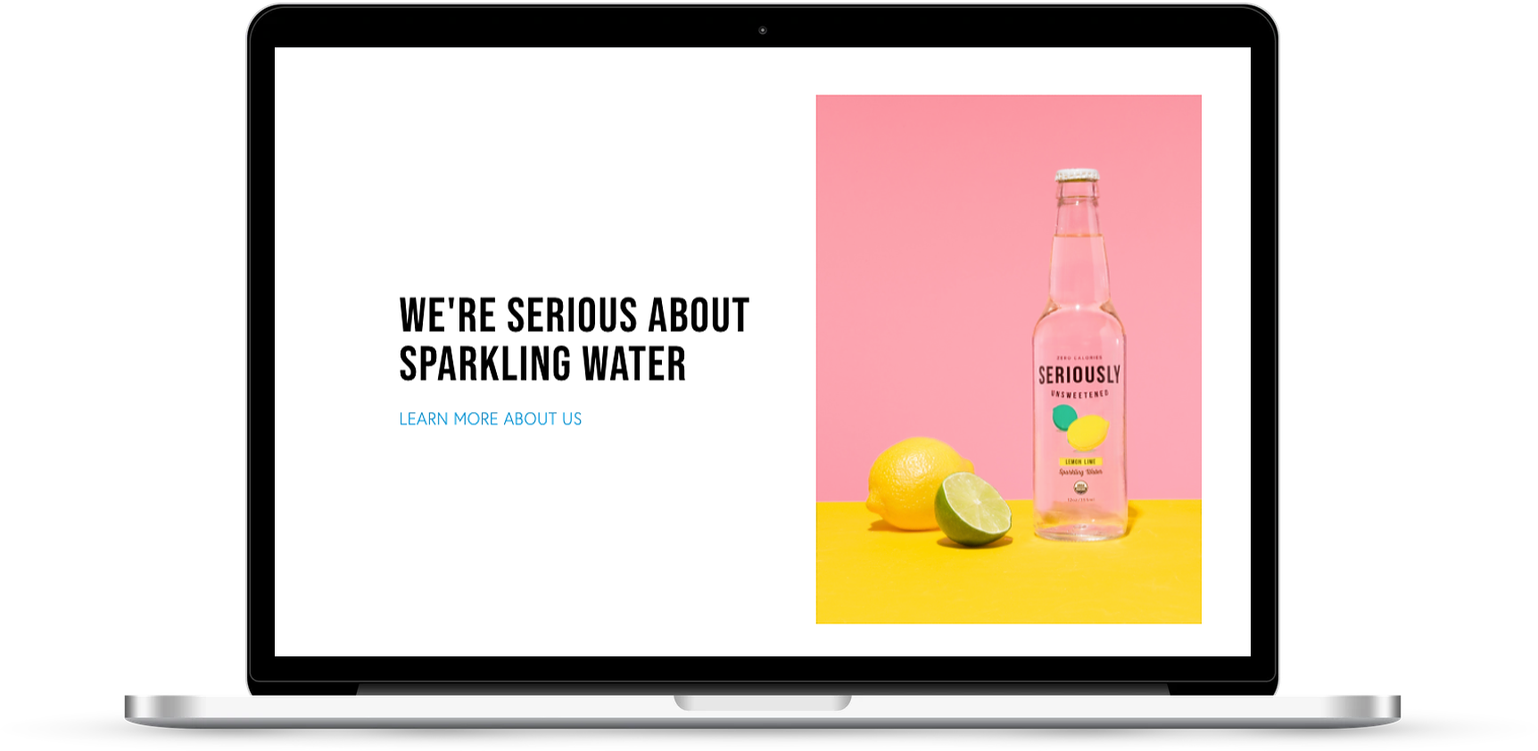
Drink Seriously - Striking, bold design
Design Principles
Now that we were starting to gain an understanding of where we want our design to go, we created these design principles.
User Testing
Summary
Demographics
28-40 years old
An equal mix of men and women
Professionals (Pepsi-co, Penguin, Self Employed)
All concerned about climate change
Tech literate
Methods
5 second test
Interviews
Prototype tests
Surveys
Dot Voting
Location
Remote via Zoom
No. of participants
4-5 per round
Rounds
3
The Snowball Website
To learn what users think of climate change and to put the Snowball website under the microscope, we conducted user interviews, a UX audit and a 5-second test of the homepage.
Our happy client Harry
Key interview takeaways:
Users feel overwhelmed with copy.
There’s too much whitespace.
Want to see relatable facts about climate impact.
How can we entice people to join Snowball?
Want more understandable impact bar.
Slim down log in process
5 second test:
19 participants
9 people remembered the brand name.
5 people mentioned climate change.
5 people mentioned community and social media.
“I want to see how the impacts are relatable to me. I like seeing numbers and graphics.” - User
Style Direction
The first step in our design exploration was to diverge by creating style tiles associated with a specific moodboard, the aim being: to help us successfully converge into one final design direction. After our UX audit, feedback from the client and our user first interviews, I was inspired to explore exciting, bold and welcoming designs.
Style 1 - Bold, Confident, Clean
Style 2 - Fun, Social, and Inclusive
Style 3 - Neighbourly, Welcoming, and Local
Key design takeaways:
The client particularly liked the use of bold colours and shapes in the style 1 Moodboard as well as the direction of the photography and card style in Style 3’s style tile.
We learned that users also tended to like bright, bold colour schemes.
Divergent Designs
Key learnings:
Users wanted to take in more actions on the homepage, they disliked scrolling and they liked bright colours.
The client wanted to see another iteration that married the bold inspiration from the style 1 moodboard mentioned above.
Prototype testing: Users shared their screens remotely
Converging into one design
To converge into one design direction, we conducted a survey that included a new converged design alongside our 3 other original designs. Out of the 90 participants surveyed and additional client feedback, the new converged design came out on top.
Converged design direction:
A bold and creative look
Engaging photography
Easily digestible action cards
Bitesize information
Logo Re-design
I saw an opportunity to improve the old logo as I thought the positive message that Snowball wanted to send was lost. I wanted to make the new logo appear more meaningful and memorable by showcasing the snowballing effect of one individual person’s action turning into a whole community of people doing the same, which symbolises real positive change. In the new logo, the yellow circle represents the user and the hot pink circle represents the community.
Design Solution
Prototype walkthrough of the website with annotations showcasing improvements.
New Design Highlights
Photography shows community taking action
Clearer message and CTA on the homepage
Microinteraction of relatable, visual content
A new progress bar makes users feel more obliged to help the cause
There’s a simpler way to take an action
Sharing your commitment provides opportunity to grow Snowball’s brand/user base
Users now understand what constitutes a score
Users felt that our popular and related topics wigit made the experience more social
We used cards to help digest key information
Next Steps
Further iterate and test the prototype
Explore typography
Create a responsive design that also works on mobile devices
Reflections
I’m really passionate about products that make a positive impact on society, so I felt pretty lucky to work on this project. It was also a privilege due to the fact that Snowball’s approach, to the biggest problem we face as humans today, was so refreshing and on point.
They had underlined the problem - that individuals don’t feel they can affect any sort of positive change, never mind a big issue like on climate change, when it comes to politics and big businesses.
It excited me that they had a solution that most people would think was achievable - by one person taking climate change action, they’re joining a growing number of others doing the same, and this momentum increase will eventually naturally force politics and big businesses to supply that demand and actually implement global change.
It really pleases me to think that by improving the overall design and usability of Snowball I may have helped empower more people in their pursuit for positive change on a global scale.
Client Testimonial
“We came to Flatiron with a website that lacked personality and structure, hoping to come away with a fresh new website design that encapsulated the bold and exciting movement we're trying to build. The team did a great job on the assignment and were a pleasure to work with. We're looking forward to developing our new website and feel we now have a brand and a website design that will allow us to get there. Thank you team!”
— Harry Pardoe Founder of Snowball


